Drawer Pattern
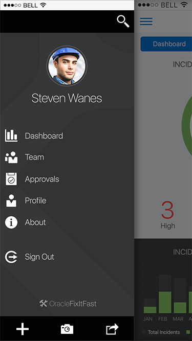
I created the visual designs below for the Alta Mobile UI Drawer pattern.
The Drawer pattern allows the user to open and/or switch between different application features. A Drawer primarily displays a menu of navigation options, which can show additional features including: search, profile, notifications, branding, etc.
Benefits of using the Drawer:
• Provides quick access to every category.
• Provides an overview of the application content.
This pattern is common for phone and tablet, with growing adoption for desktop usage.
Drawer Drill In
On the right side of a list item, an optional caret/arrow can be displayed to indicate that item can be drilled in on. A contextual menu is displayed when an item is drilled in on. User profile information (i.e. a photo/avatar and name) can be placed at the top of the Drawer, below search.
Drawer Drill Out
Tapping the Back button in the Contextual Header will navigate the user back to the top level of the drawer.
Drawer Toolbar
Drawer Toolbox icons are functional and mono chromatic.
Drawer PersistEnt Search
Drawer icons are functional and mono chromatic.
Drawer Hidden Search
When a big avatar is used, the search icon may be placed in the upper right of the Drawer. Tapping it will replace Drawer with Search textbox.
Drawer Empty Search
Drawer Auto Suggest Search
As the user enters text into the search field, a list of matches display outside. Results update as the user types.


